Ask the Architect
Talk about street cred; our team feels so fortunate to be led by a seasoned Architect (now Retired, Life Member) and mentor with 40 years’ experience.
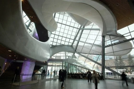
Over his career, Rick lead a large Architectural Firm of over 65 employees completing Architectural commissions including Urban Design, Master Planning, Civic Buildings, Multi Family Residential, Office and Commercial Retail Projects across Western Canada and into the US. During his tenure, the firm received many distinguished Architectural Awards. Amid his lengthy career, Rick has acted as the Project Director for a large variety of projects, most notably the prestigious Art Gallery of Alberta, from the inception of idea through the build of the regional Art Gallery. He led the Gallery board of directors through Architect selection by way of competition, to the award of Contractor, and represented the AGA ‘s board through construction to hand over.
Image credit: cbc.ca
Rick has since retired from leading the large architectural firm to consult select clients and non-profits on design concepts and project management. He most recently worked with Pilgrim’s Hospice on the recently completed hospice in Crestwood and was assisting Breath: The Lung Association with a potential new building in Edmonton. Since his retirement from his Architectural Career, Rick founded and is part owner of Urbis Infill Homes. You may or may not know this, but Urbis is a family business. Rick is part owner with managing partner, and son, Mike Arndt. Mike and Rick have been partners for over 13 years! Rick also works closely with our design lead, and daughter Katie Warwa. Katie followed in Rick’s footsteps and has her Masters of Architecture Graduate Degree. Together, Rick, Mike and Katie make up that family behind Urbis Infill Homes. As far as hobbies and leisure time Rick is an avid fisherman and family man who enjoys spending time with his grand kids at the lake.
We asked our community on social media to to submit their questions to ‘Ask the Architect’. Here is what came of this candid Q & A…
What would be the major concern in undertaking a reno on a 100 year old home?
Firstly understanding what the zoning may be is important as some older homes can have heritage The integrity of the structure is a major concern. In our experience we have seen homes that has been renovated over the years, and done incorrectly. This might be a red flag to consider as we have come across some scary DIY renovations or additions where we basically had to reframe the entire house.
Is there a way not to have a massive 5” cap flashing on a flat Roof parapet?
Stepping the fascia can lessen the appearance of cap flashing, or some metal panel systems have options to reduce or conceal the cap flashing.
How does your ACM on the 146 St project avoid cap flashing?
We have used a product called Strada Clad from Lenmak that has a concealed flashing that appears minimal.
How can one be part of the Urbis team?
We are a pretty intimate team at the moment, however if opportunities arise you can find them posted on LinkedIn, our website or social media!
What do you think of cement floors?
Not a huge fan of cement floors in residential applications, however if done correctly they can bring a timeless quality to an interior palette. Specifications, quality/experienced trades and custom rugs are key in combination with Concrete Floors in residential.
What is your favourite house built?
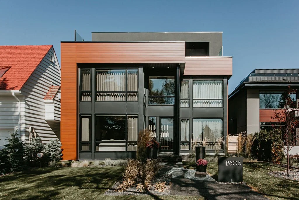
Our Ravine Drive West Project is one of my favourites built to date, the street presence was pretty successful, and I think the materiality had a really good impact.
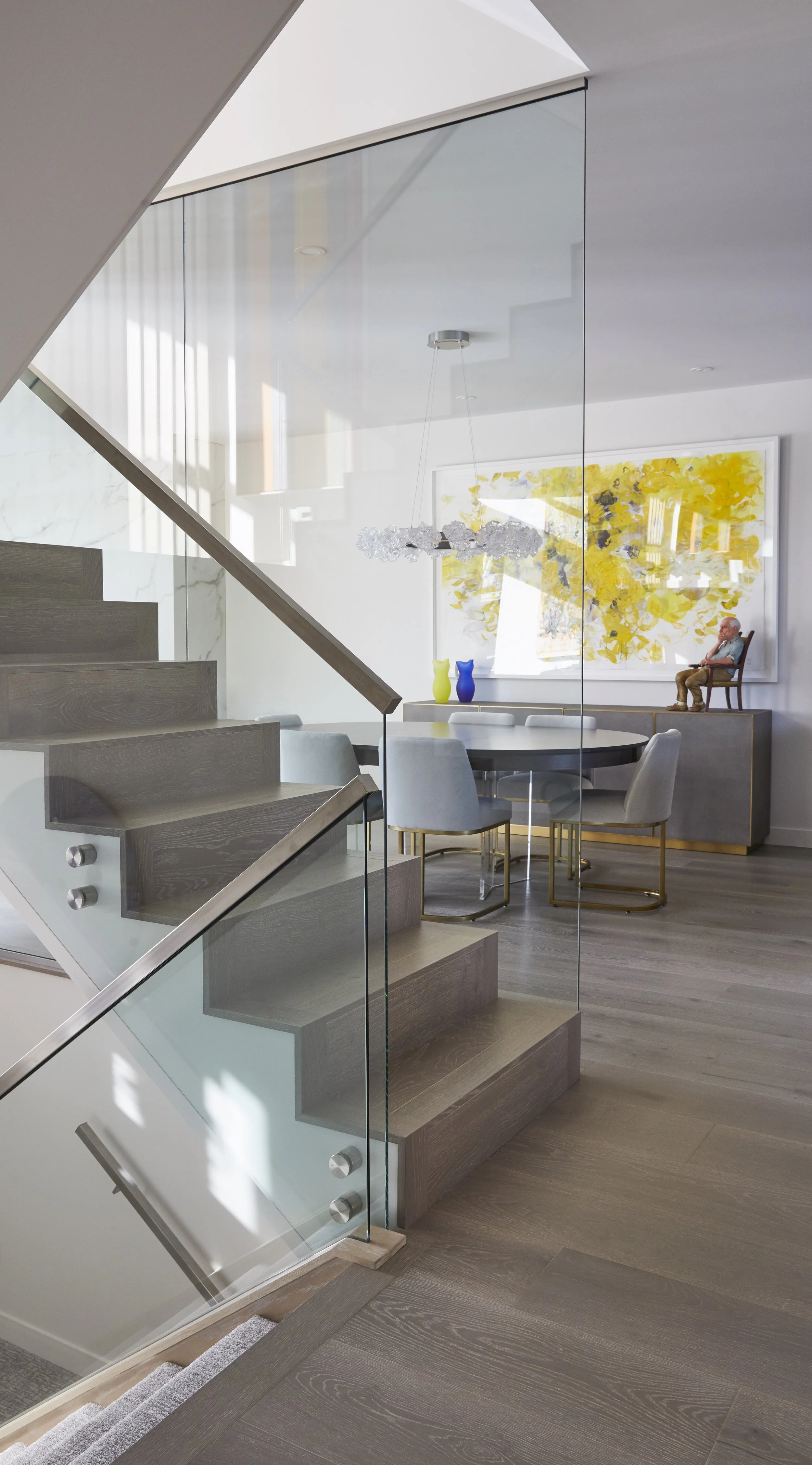
A closer look at Rick’s favourite – Ravine West
How to achieve this look…
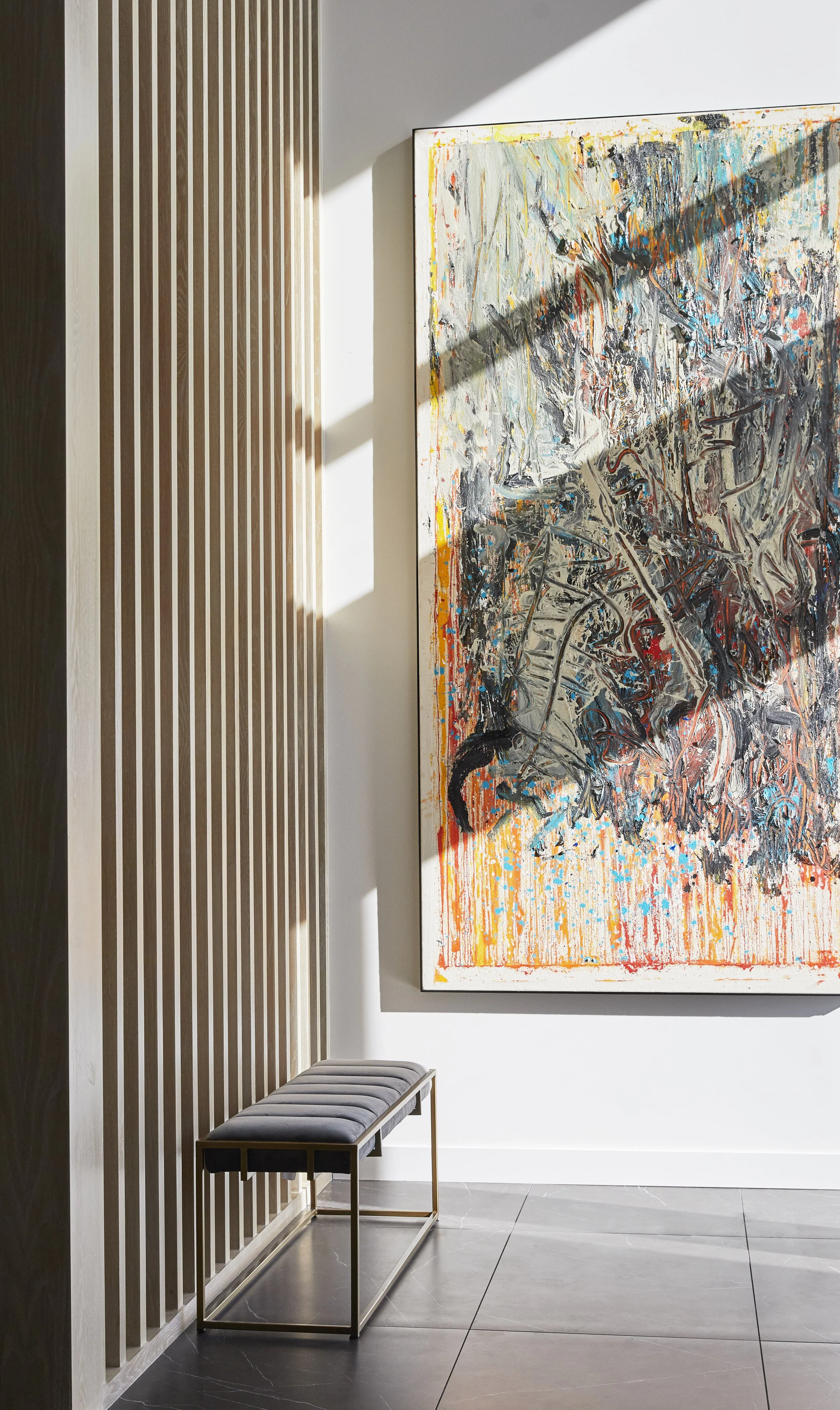
Gallery Feel:
Paint your walls and trim the same colour for an elevated look that doesn’t distract from your focal point. Our favourite is Sherwin Williams, Origami White. It has a warm, neutral base that isn’t harsh and cold.
Another tip; keep the flooring simple.
Paint: Sherwin Williams – Origami White
Hardwood: Torlys Sedgebrook 7” Super Solid
The Ensuite:
We used porcelain tile that mimics marble for this ensuite. Porcelain is easier to maintain and is usually more affordable than the real thing. At 24” x 48”, this tile brings drama to a minimalist design and compliments the organic curve of the freestanding tub.
Tile: Dal Tile, Marble Attache in a matte finish
Tub: Bain Ultra, Evanescence Oval
Tub Filler: Kohler
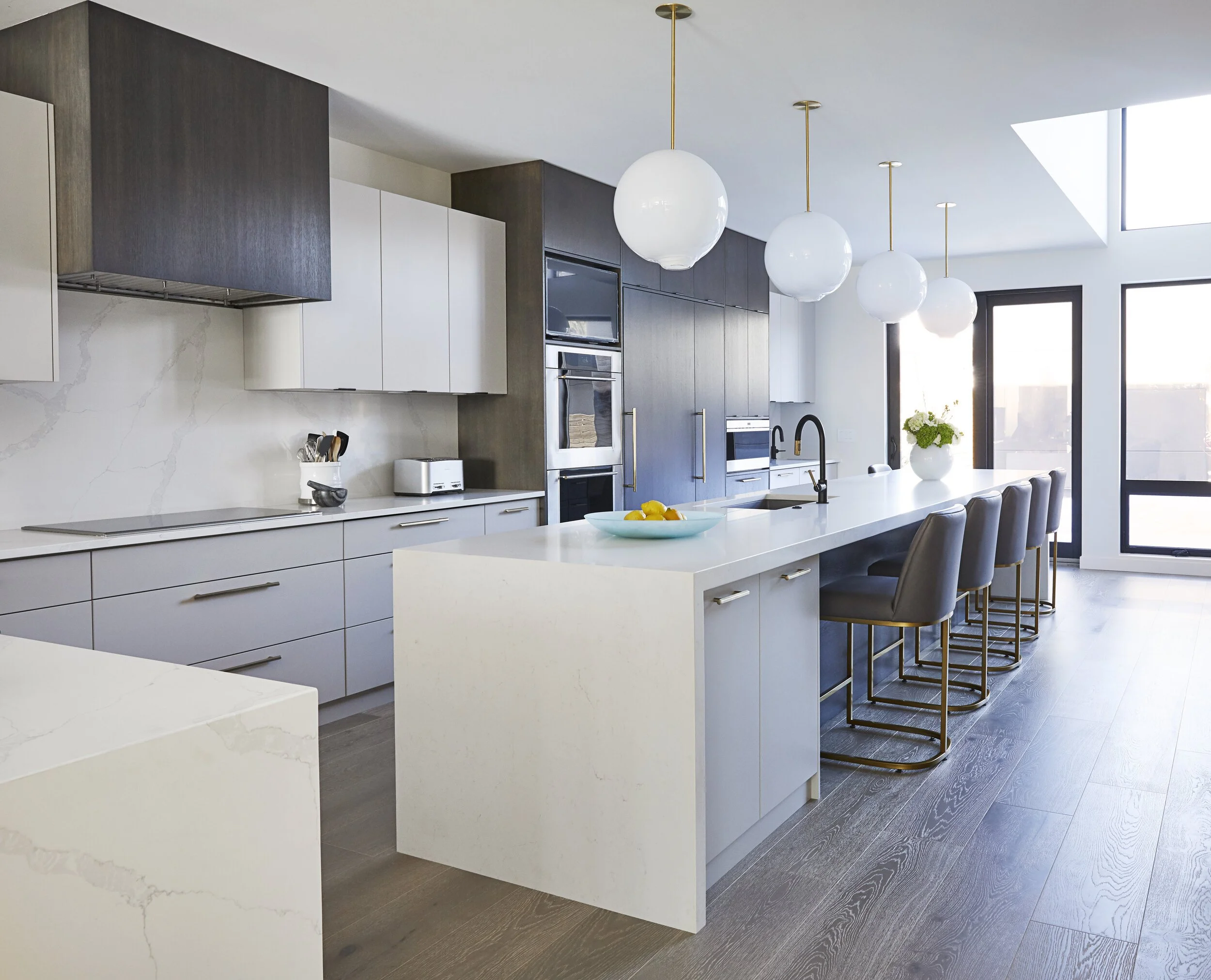
Modern Kitchen:
Modern can be as simple or complex as you’d like. The key is to work with clean lines and complimentary colours to create a cohesive aesthetic. We used three colours to add depth and visual texture – Charcoal oak, warm grey and white. Consider “panel ready” appliances for a seamless look where possible and don’t forget modern pull hardware.
Appliances: Subzero and Wolf
Cabinet Colours:
- Grey: Sherwin Williams, Alpaca
- White: White on White
Wood: Oak with dark charcoal ash finish
Lighting: Sklo
Hardware: Emtek
Or take a virtual tour of some of Ricks older commissions:
Thank you to everyone who submitted questions for our “Ask the Architect” series. We hope you enjoyed reading some of Rick’s responses and taking a closer look into one of his favourite projects! We have some incredibly talented, experienced individuals on our team, and we look forward to continue to sharing their expertise with you in the future!


